Play Store: If you are someone who loves a clean, organized phone layout, you already know the struggle of balancing functionality with screen real estate. Google seems to have finally taken notice.
A fresh deep-dive into the backend code of the Google Play Store (specifically version 52.1.26-31) reveals that Google is preparing to dismantle its clunky, one-size-fits-all widget system in favor of something much more surgical: individual category widgets.
The Problem with the Current “Collections” Setup
A couple of years back, Google introduced “Collections”—a handy backend feature that automatically sorts your apps into logical, thematic buckets like Shop, Listen, and Food. It was an excellent concept for the app drawer, but things got messy when Google tried to bring that organization straight to your home screen.
Right now, if you want to use a Play Store Collections widget, your choices are frustratingly rigid. You can either pick a tiny box packed with a cluster of random category icons, or clear out a massive portion of your screen for a large widget with a sprawling multi-category sidebar.
The issue? You are forced to look at every single category at once. If you only care about quickly launching your music apps, you still have to dedicate screen space to shopping or travel folders you might rarely open.
Enter the “Single-Flavor” Widgets
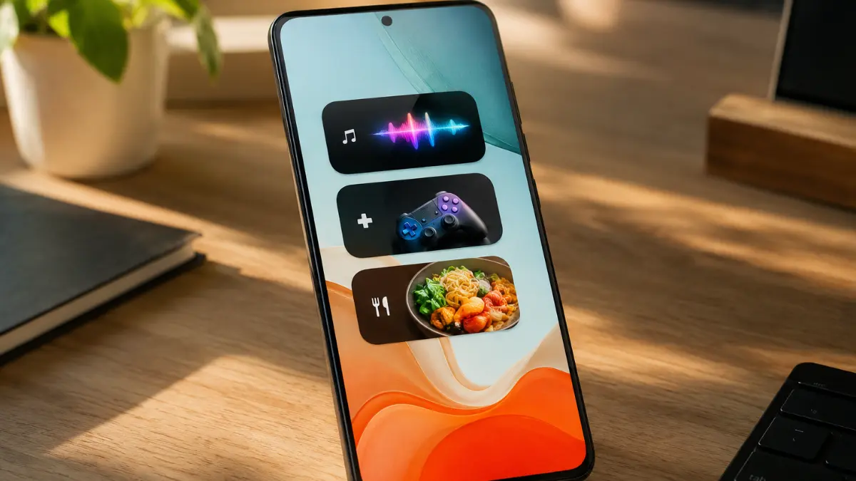
The upcoming update aims to hand complete aesthetic control back to the user. Instead of forcing you to accept an all-or-nothing bundle, Google is splitting Collections down into eight distinct, standalone widgets.
You will soon be able to pick and choose exactly which individual categories earn a spot on your desktop layout. The code points to eight specialized options:
- Listen: One-tap access to your favorite music platforms, podcast players, and audiobook libraries.
- Game: A dedicated launchpad highlighting your active mobile gaming catalog.
- Food: Quick shortcuts for food delivery tracking, restaurant apps, and digital cookbooks.
- Shop: Keeping your most-frequented e-commerce and retail apps neatly bundled together.
- Social: A streamlined spot for messaging networks and community platforms.
- Watch: Showcasing your video streaming subscriptions and movie apps.
- Read: Fast access to news readers, article catch-ups, and e-book libraries.
- Travel: Grouping together your ride-sharing apps, navigation tools, and flight trackers.
Why This is a Big Win for Android Customization
This modular approach is a massive quality-of-life upgrade for minimalist setups. If you are a mobile gamer who doesn’t care about digital reading, you can slap down a single, sleek “Game” widget right above your dock and completely ignore the rest. It frees up incredibly valuable screen real estate while making the home screen feel purpose-built for the way you actually use your device.
Because this change was spotted during an APK teardown—which essentially means looking at work-in-progress blueprints hidden inside the app’s installation files—these individual widgets aren’t officially live just yet. Google is still polishing up the exact sizing behaviors and visual assets before pushing the update out to the public. However, it gives us an exciting glimpse into a much more flexible, user-friendly future for Android’s interface.